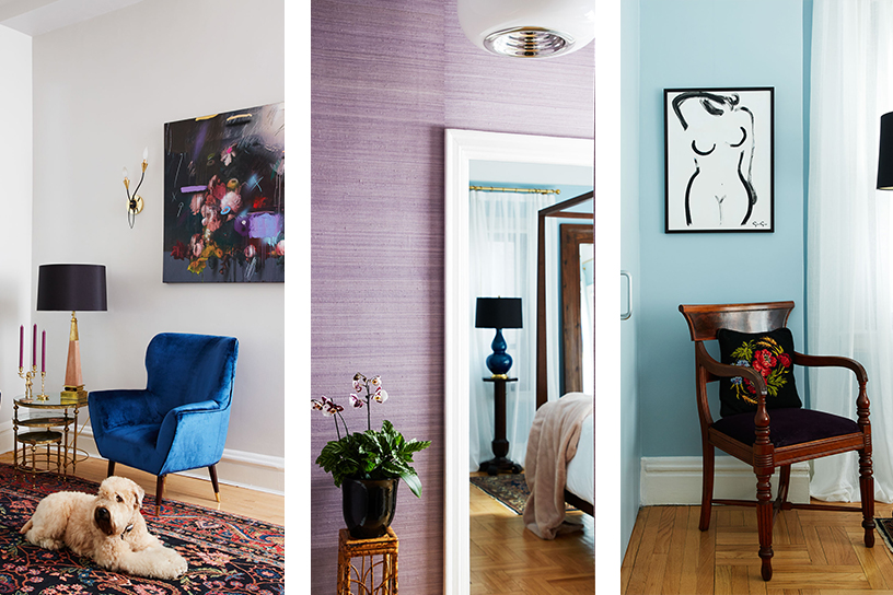
When Homepolish designer Deanna Dewey first saw her client’s Carnegie Hill apartment, it hadn’t been redesigned since the ’90s. Below she shares how she was able to look beyond the wall-to-wall red paint to transform the space into the “mid-century jewel box” her client desired. Homepolish is an NYC-based, end-to-end design service. Learn more and book a complimentary consultation at Homepolish.
Antique Details, New Design
What was Deanna’s first impression of her client’s 1,000-square-foot co-op on the Upper East Side? “Red! Red everywhere!” But, after looking past the bright paint color, she was impressed by the prewar details that lay underneath, and classic junior 4 layout. “It had a nice flow, and I used that to inspire how the spaces played with one another,” she says of the floor plan.
To start, the red paint was quickly replaced with Farrow & Ball’s delicate gray shade, Dimpse, before she got to work highlighting the home’s original wood floors, high ceilings, and beams. Not all of the historical elements were welcome, however.
“The room’s architecture is not symmetrical, so neither were the windows,” she notes of the project’s biggest challenge. “It was hard to dress the windows without drawing your eye straight to this unbalanced feature.”
Flowy, white curtains provided some camouflage, but rather than fight the layout, she went with it. Two distinct spaces were created thanks to a Paolo Buffa-style mid-century bar placed to the left of the windows while two large, velvet chairs formed a seating area to the right, which allowed the table to be centered against those pieces, rather than the window. The changes keep your eyes moving, and “avoid a battle with the asymmetry of the architecture,” she says.
Be Impactful, Not Overwhelming
While a new paint color might have provided one of the apartment’s most dramatic changes, it was a more subtle change in lighting that Deanna appreciates the most. From the start, she and her client aligned on a jewel tone color palette to use throughout the home. To help balance the bold colors and furniture, Deanna brought in natural elements like silk wallpaper and live-edge olive wood entryway pieces, along with mid-century Italian lighting to create the first impression for visitors. “By creating a calm and welcoming entryway, your eye is present in the space. You can have an impactful room that is not overwhelming,” she advises.
For All Ages
Throughout the redesign, Deanna used the prewar architecture as her guide, but to ensure the apartment didn’t feel stuck in the past, she took a mix-and-match approach. “Mix it up to keep it interesting,” she says. “Pull in contemporary pieces as well as antiques.”
A pair of wall sconces by French designer Jean Royère was a serendipitous find, as his work had been used as inspiration since the beginning of the project. The lamps were mixed with custom furniture, like the olive wood pieces in the entryway, and Italian mid-century chandeliers. “It’s really about creating a mix of pieces and design references that work well together so you never feel stuck in one decade.”
As for her client, who is a best-selling author and sommelier who was ready for a change following her divorce, Deanna said “she was thrilled and ready to start hosting her wine parties!”
Visit Homepolish to view more photos of Deanna’s design
Photos by Genevieve Garruppo for Homepolish
Design by Deanna Dewey