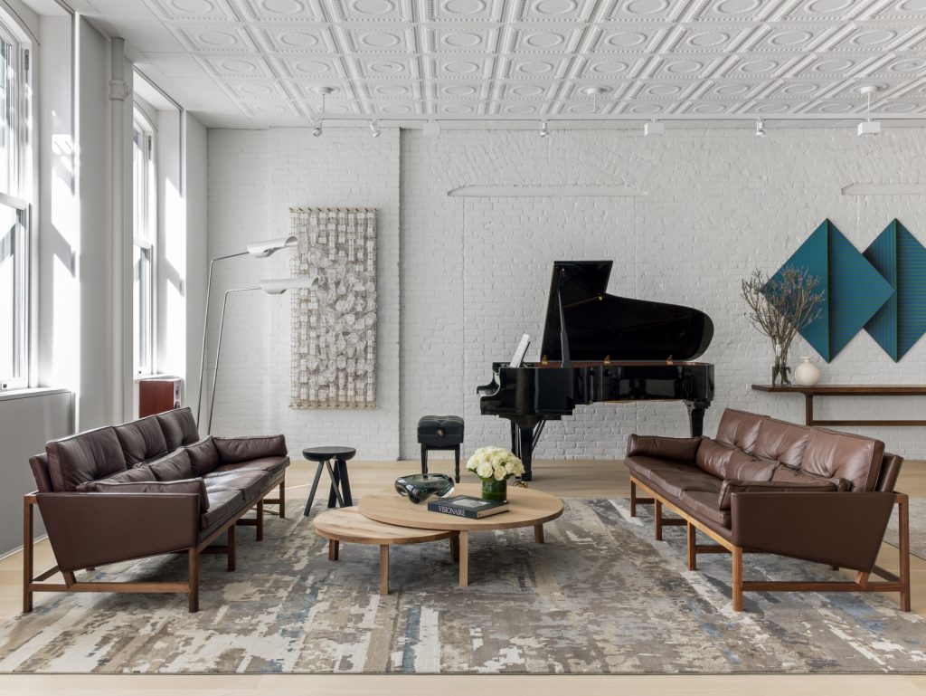
When Homepolish designer Justin Charette first saw his client’s newly renovated SoHo loft, he knew his biggest obstacle would not be decorating the expansive, 3,000-square-foot space, but rather his client’s very tight timeline. Here’s how he designed the bright, modern home in just four months.
Homepolish is an NYC-based, end-to-end design service. Learn more and book a complimentary consultation.
Not Too Big, Not Too Small
While the unit’s 12-foot ceilings were a major highlight, their height did bring challenges when selecting furniture: “I wanted to make sure that the pieces did not feel dwarfed by the volume of the space,” Charrette says, “and at the same time make sure they were not bulky, as my client liked streamlined furniture.”
Finding custom pieces, like mid-century-style tufted leather sofas from BassamFellows, and adding a variety of side tables in diverse woods, allowed him to maintain the “bright, minimal, and masculine” design he and his client desired. “I love the furniture layout throughout the redesign,” Charette told Homepolish. “It feels complete, while still leaving plenty of open space, which highlights the large-size rooms. This also allows you to see each piece from every sightline.”
Break It Up
From the start of the design process, one of Charette’s top priorities was to divide up the large loft. “I wanted to have clear, defined spaces for living and dining that still felt open,” he says. Floor-to-ceiling custom cabinets created by architect Andrew Berman provided “tons of storage, [while] acting as a partition between the entrance hall and main living area.”
A less dramatic but equally impactful change came through the choice of furniture. “Adding warm, walnut tones had the biggest impact on the space,” says Justin. These included the overlapping coffee tables and wood-framed dining chairs, plus the living room sofas. “It provided the needed contrast to break up the lighter wood tones from the cabinetry and flooring.”
Busy Outside, Calm Inside
The landmarked SoHo building dates to 1910, and has the original stamped tin ceilings, exposed pipes, and columns to show for it. “I was impressed by the amount of space and windows throughout,” Charette says. “I thought it was a great backdrop for carefully selected furniture that would complement the renovation and existing industrial elements.”
To find inspiration for the home’s color palette, Charette simply looked out the window. “Drawing from the mostly neutral palette seen from the loft’s windows, I naturally gravitated towards a soothing palette infused with thoughtful moments of color that echo what’s happening directly outside,” he told Homepolish. Wall art, geometric vases, and even a deep burgundy sofa in the music room all provided color, while Farrow & Ball’s All White paint, hand-knotted carpets, and structural light fixtures helped provide Charette’s client with a truly striking respite from the city outside.
Visit Homepolish to view more photos of Justin Charette’s designs.
Photos by Sean Litchfield for Homepolish
Design by Justin Charette.
—
Send your NYC real estate stories and tips to StreetEasy editors at tips@streeteasy.com. You will remain anonymous. And hey, why not like StreetEasy on Facebook and follow @streeteasy on Instagram?