Whenever we place our before and after photos side by side, it’s usually the projects where there was a full gut renovation where we see a significant difference. Walls get removed, new kitchens go in, extensions get built. For this one, a three-bedroom condo in Tribeca, there was actually very little in terms of built work. The change really came about when we put together a fresh palette of materials, colors, and textures for an overall brighter and modern-yet-soft feel.
The Desired Work Plan
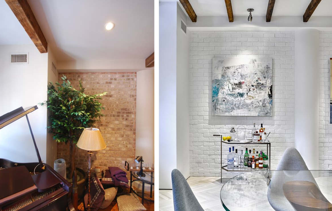
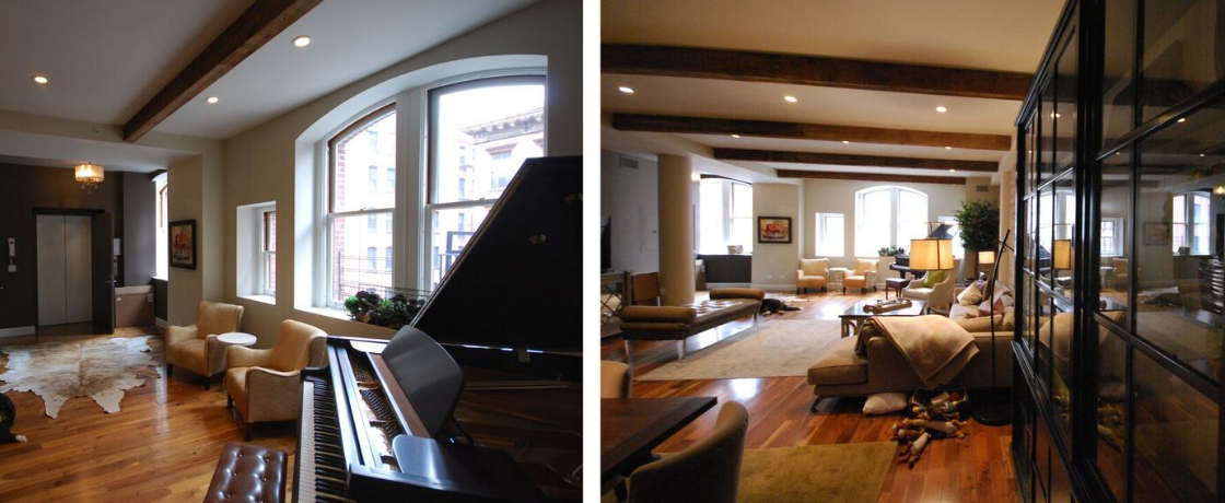
One of the first views when walking into the condo. Since the piano wasn’t used, it was donated to a local school and we made room for something that would earn its keep — a beautiful bar cart. (Note: All “after” photography by Garrett Rowland.)
Our clients, a couple about to become parents for the first time, had a few simple requests: To make the space feel brighter, make the floors lighter, and re-do the master bathroom, as well as the powder room and guest bath.
Since the space was renovated by a developer several years earlier, we had a good layout to work with (with a couple of exceptions discussed below), so we could really focus just on the cosmetic upgrades and source furnishings in line with the clients’ objectives. Lastly, we were on a tight schedule. The project started in June 2016, and had to be completed by December 2016 in time for the baby’s arrival.
Upgrading the colors and lighting
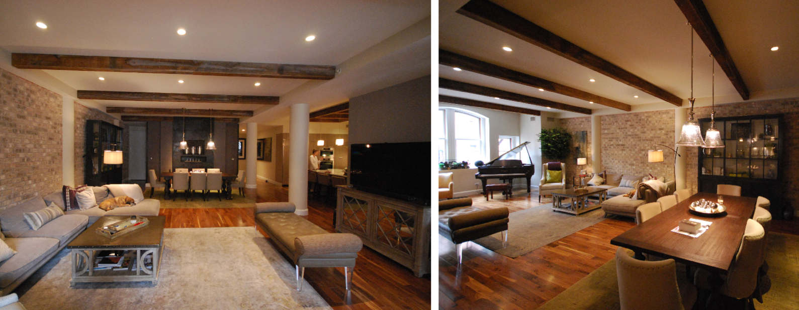
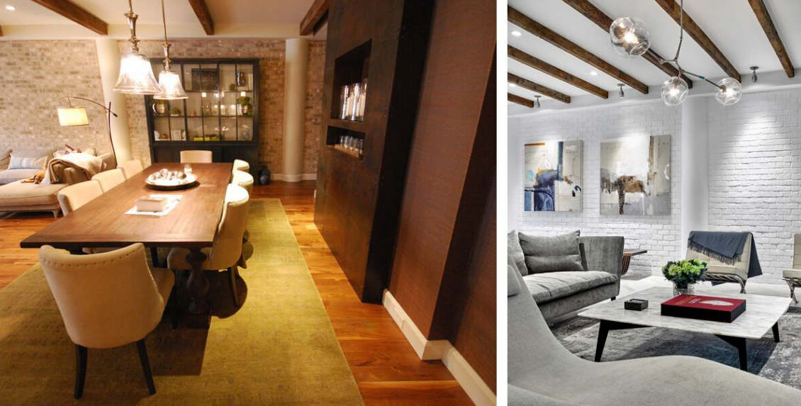
Prior to the renovation, the living and dining areas were reversed. We opted to change that because the clients use the kitchen and living areas most, so co-locating them made more sense. Above are “before” views of the living and dining areas. Click image to make larger.
Prior to the renovation, exposed brick, a mix of colors including off-white, beige, brown, and muted green, and dark hardwood floors made for a more traditional look, but it felt a bit too dark, even during peak daylight hours. Windows were limited to the bedrooms on the south and north sides, so finding ways to bring light into the core — naturally and with better lighting — was essential.
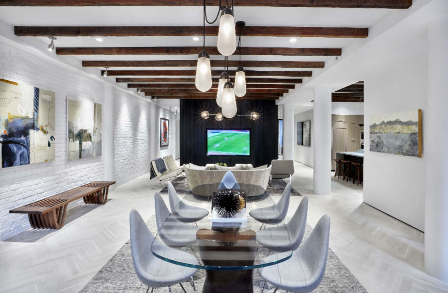
The living and dining areas after the redesign. There is a walkway completely around the pod (where the TV is located) and the door on the right in the background brings light in.
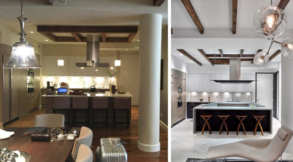
Work on the kitchen was limited to painting the lower cabinets, replacing the joists, lighting, and countertop, and putting in a new backsplash.
There were several solutions. First, we repainted the entire living area and kitchen white, including the brick wall. The bedrooms were re-painted in almost-white shades of gray. The floors were replaced with bleached oak in a herringbone pattern. We also replaced all lighting (existing MR16 halogen lamps that produced very little light and burned out often) with high-efficiency LEDs with a higher lumen output.
Layering in new materials and textures
We wanted to make sure that the brightness didn’t completely wipe out the warmer feel that existed before. We did this with a variety of textures and materials. In the dining area, a glass tabletop was balanced by a walnut table base, upholstered dining chairs, and a sumptuous rug. In the living room, we mixed leather, Calacatta marble, velvet, and wool. Accent pieces in walnut and brass, as well as decorative lighting in a mix of metals, added more warmth to the space. And in the kitchen, we replaced the polished countertops with a honed concrete surface.
We wanted to keep some of the warmth that was in the home before. To that end, we balanced the brighter, more contemporary elements with materials like walnut, wool, velvet, and marble.
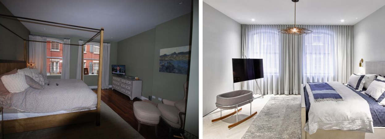
We also paid close attention to textures and materials in the bedrooms, especially with the window treatments. In the master suite, floor-to-ceiling curtains glide along a recessed track and add a layer of understated luxury that wasn’t really there before. The relaxed Roman shade in the baby’s room is made of an ombré linen and adds to the mix of wool, tweed, and sheepskin.
Looking for opportunities with existing features
This is a “before” image of the windows on the north wall, which were fragmented and didn’t make the most of the view.
There were several existing elements that we focused on improving. First was with the window wall near the entryway. It seemed unfinished, and the windows were of varying size and not at a height to fully appreciate the view. We couldn’t do anything about the placement of the windows, but we could bring some organization, geometry, and functionality to the area.
First, we built out an archway that was more in line with the scale of the room. We then painted the inner areas black to make the wall a feature element (a surprise benefit: it made the windows pop). As a final step, we designed a continuous bench/shelf/window seat to make the previously fragmented and unused area both functional and special.

Here you can see how an arch, black paint, and millwork make this area a new focal point.
Another feature that seemed out of step with the scale of the space was the wood beams. With just four of them, they were spaced out just a bit too far to make an impact. Our solution: a denser layout with reclaimed joists with an oiled and brushed finish.
Reworking the layout only where necessary
Our objective was to leave this project to the purely cosmetic, but there were a couple of layouts that were begging for a re-do! First case in point: the pod-like element in the middle of the space. If you look at it straight on from the living area, you can see that to the right is a walkway to the bedrooms. On the left side, ‘before’ images show that the hallway stopped shortly after the powder room, and a door led to a storage room that could have been designed to be more efficient.
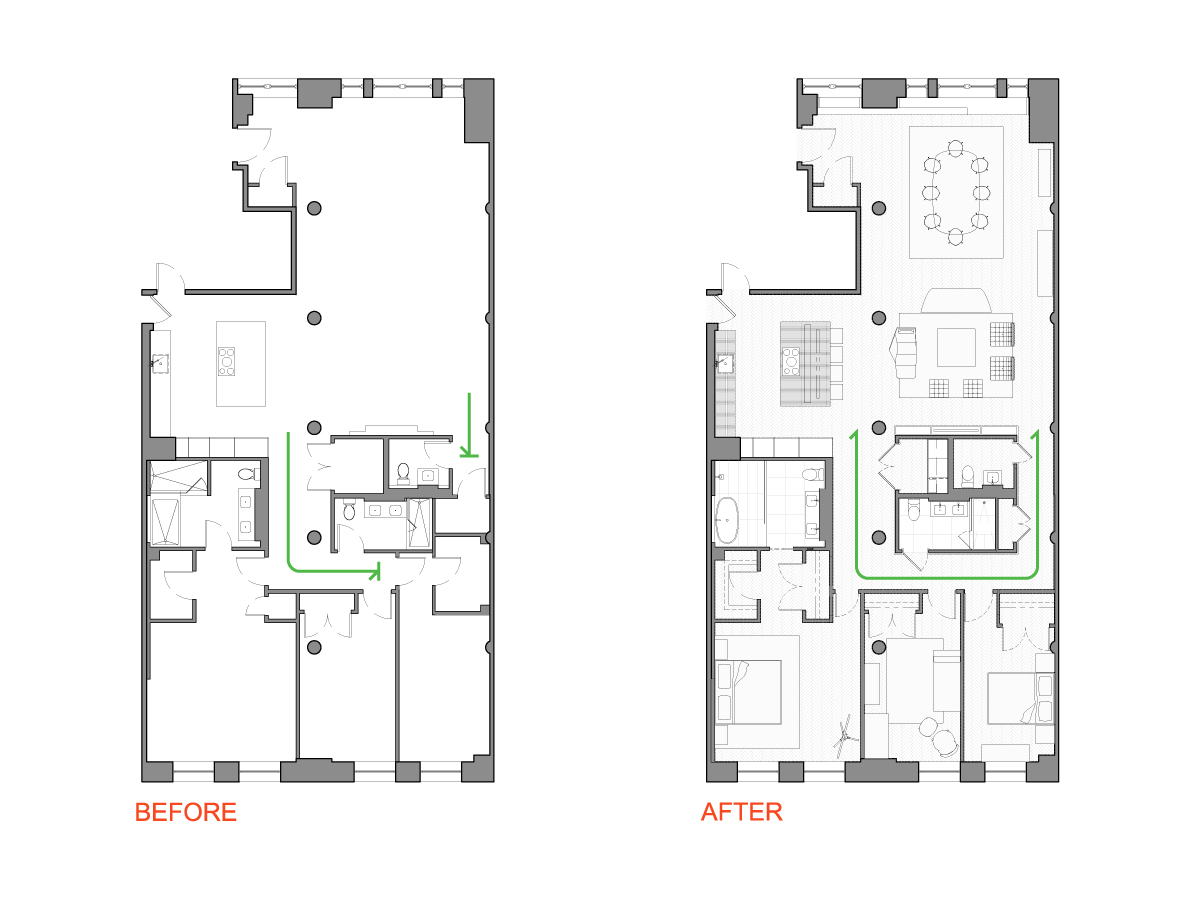
The floor plan: Before and after. Note the area surrounding the core. By creating a continuous path around and reorienting the door to the master suite, we were able to create a better sense of flow, grander feel, and introduce more daylight.
By taking that storage room out (but still keeping a well-planned utility closet within the pod), we managed to create a grander feel for the living area. Another example is with the entryway to the master suite.
Previously, the door was at the end of the hallway, to the right. By moving the door opening to the adjacent corner (parallel to the far/south wall), we could do two things: Get more daylight into the core of the space if the bedroom door is left open, and re-work the positioning and improve the sizing of the closets within the suite.
Small rooms and big changes
The before and after images of the bathrooms — particularly the master bath — are perhaps the most dramatic. They also illustrate how opportunities abound when it comes to tile! In all of the bathrooms, we kept the same layouts, but used new tile and vanities (primarily sourced through Porcelanosa), as well as new plumbing fixtures.

Previously, the master bath seemed a bit crowded, especially in the tub and shower areas (above). By combining the two and putting in a glass partition, the space feels much bigger. In the guest bathroom, we took out the rarely-used tub to put in a walk-in shower. The powder room has upgraded finishes to be more in line with the living area. The master bathroom seemed cramped before.
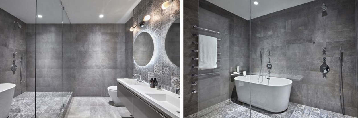 The new master bathroom not only has a more luxurious, refined materials palette. It also feels more spacious, thanks to the glass partition and the combined shower/tub area. The result is a place that’s a true reflection of the couple. When we started the project, we knew the husband and wife had varying tastes — she leaned towards more traditional, he prefers contemporary. We were able to address both through the careful combination of materials and forms so they both feel happy and right at home. And soon enough, we’ll know the little one’s favorite spots in the home!
Related: