Living in NYC comes with its own challenges. First, you have to find an apartment and then turn it into a home you love. Megan Hopp, one of the design pros at Homepolish, an NYC-based, end-to-end, residential and commercial design service, shares how she transformed her dark and dingy West Village rental apartment. Learn more and book a complimentary consultation with at Homepolish.
 Designer: Megan Hopp
Moved from: Cambridge, MA
Moved to: West Village
Rent or buy? Rent
Space challenge(s): “Working within an exceptionally small space (so small, there’s no oven), to create a comfortable and attractive space with as much discrete storage as possible.”
Apartment search journey: “After my last apartment search I’ve most likely landed a spot on the NYC brokers’ blacklist. I remember saying to my first (of many brokers), ‘I know what I’m asking for doesn’t exist on paper, but I feel confident I’ll find it, it’s just going to take awhile.’ “
What she looked for: “Because I love a good DIY apartment makeover, I didn’t pay much attention to the inside of the apartments I was looking at. Rather, I was obsessed with the location. I have continually sacrificed modern amenities (like that new fancy oven invention), and SPACE. Having never lived in a big apartment has fueled the organizer in me, which very much influences my work as a designer.”
Megan’s Apartment BEFORE:
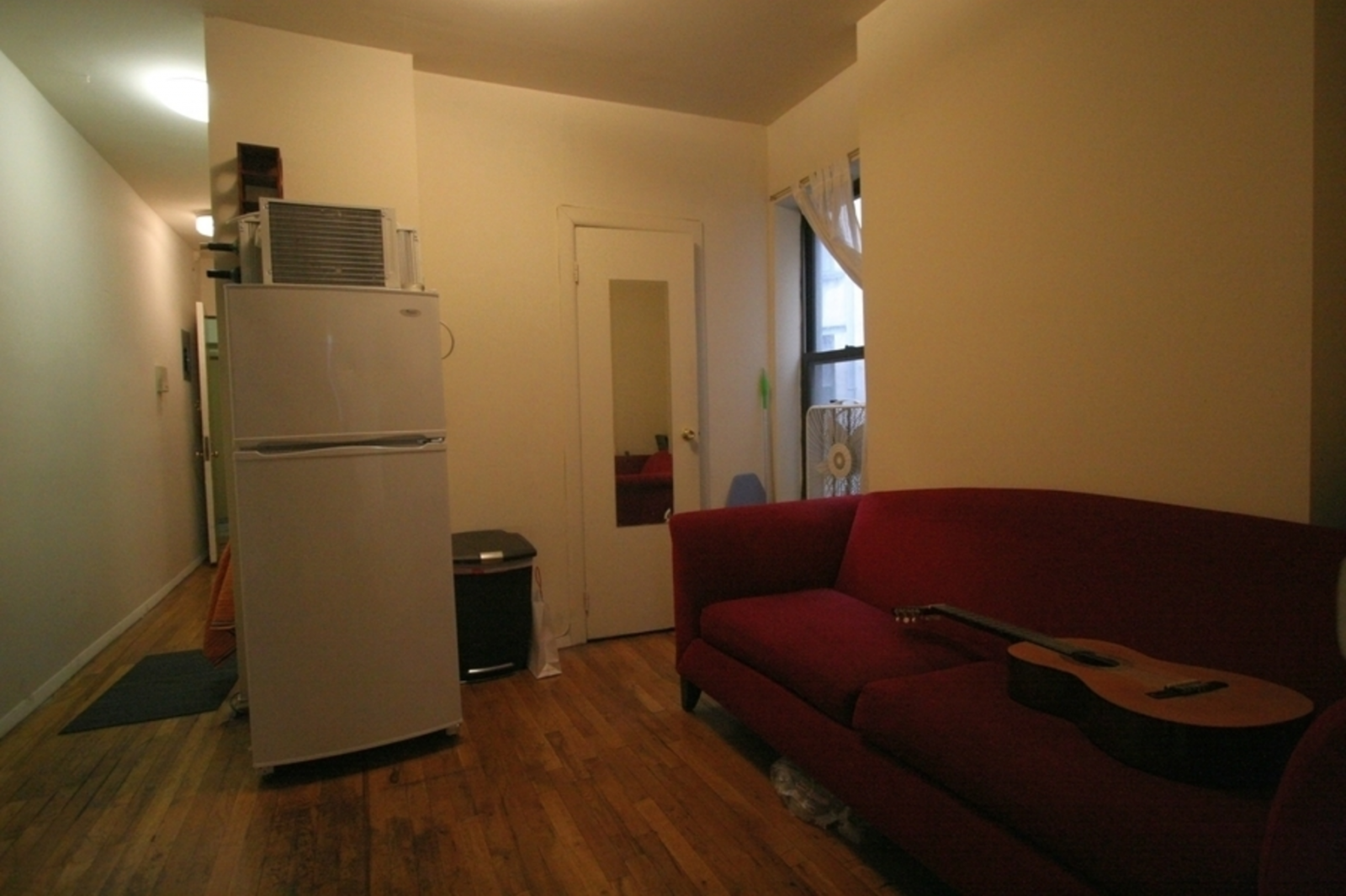
“My apartment looked much like a small, dim nondescript hole in the wall made of butter. Yellowy nothingingness would be a good way to describe the aesthetic.”
Megan’s Apartment AFTER:
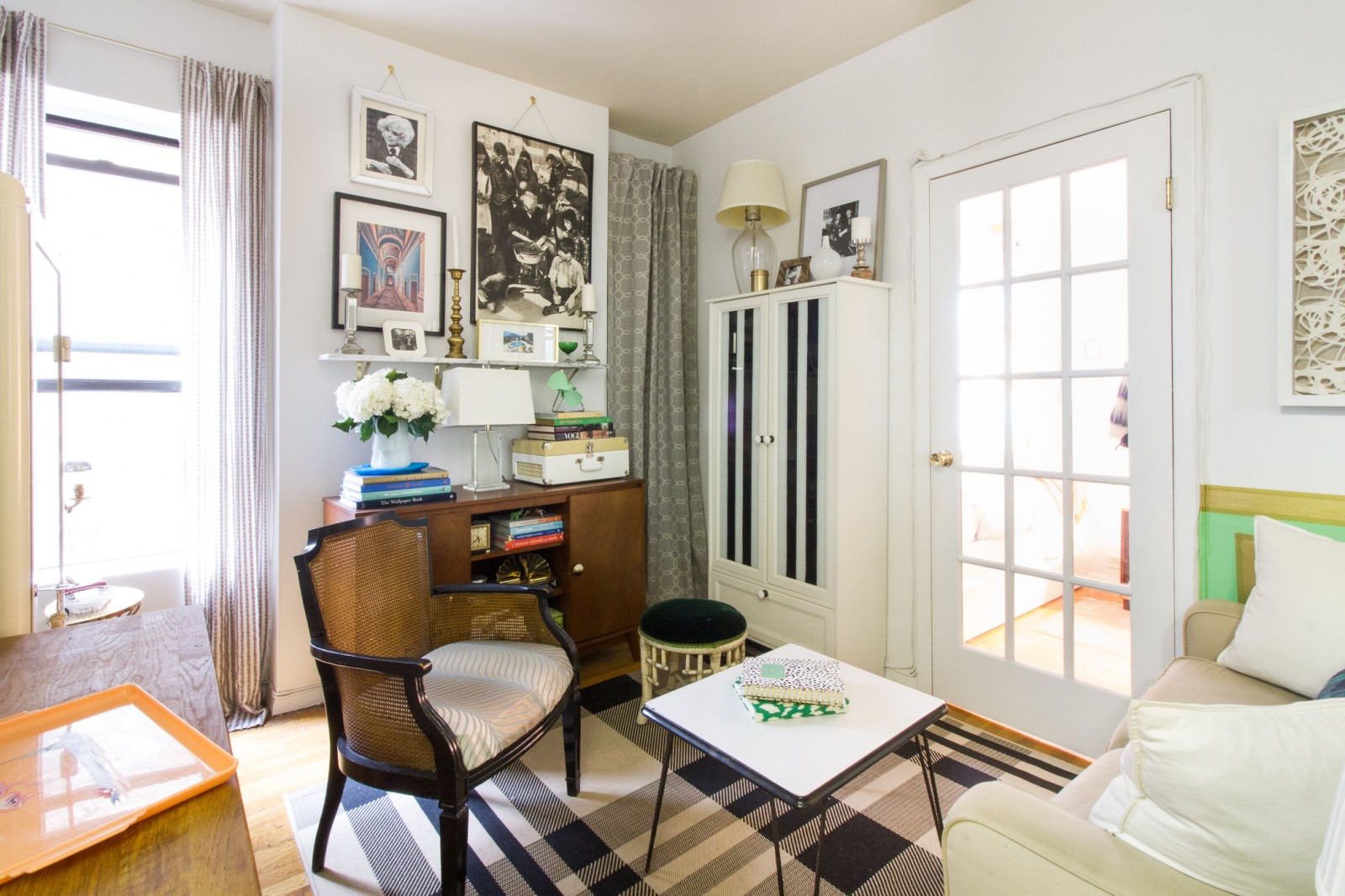
NOT TOO BIG, NOT TOO SMALL, JUST RIGHT!
Even with experience living in cities like San Francisco and Cambridge, Megan’s West Village apartment was the smallest she’d ever lived in. Not wanting to live in a “miniaturized world in my tiny apartment, with an itty-bitty table, and super small sofa,” Megan used the advice she shares with her design clients: “The best recipe for a large and welcoming space is to fill the room just enough.” Megan says that clients with small spaces will often under-furnish a room or apartment in an attempt to keep the home open and calm. But, that’s incorrect. “Don’t fear the clutter!” she says, adding, “Although it may feel counterintuitive, filling a space with the right amount of furniture is the key to a well balanced and successful design.”
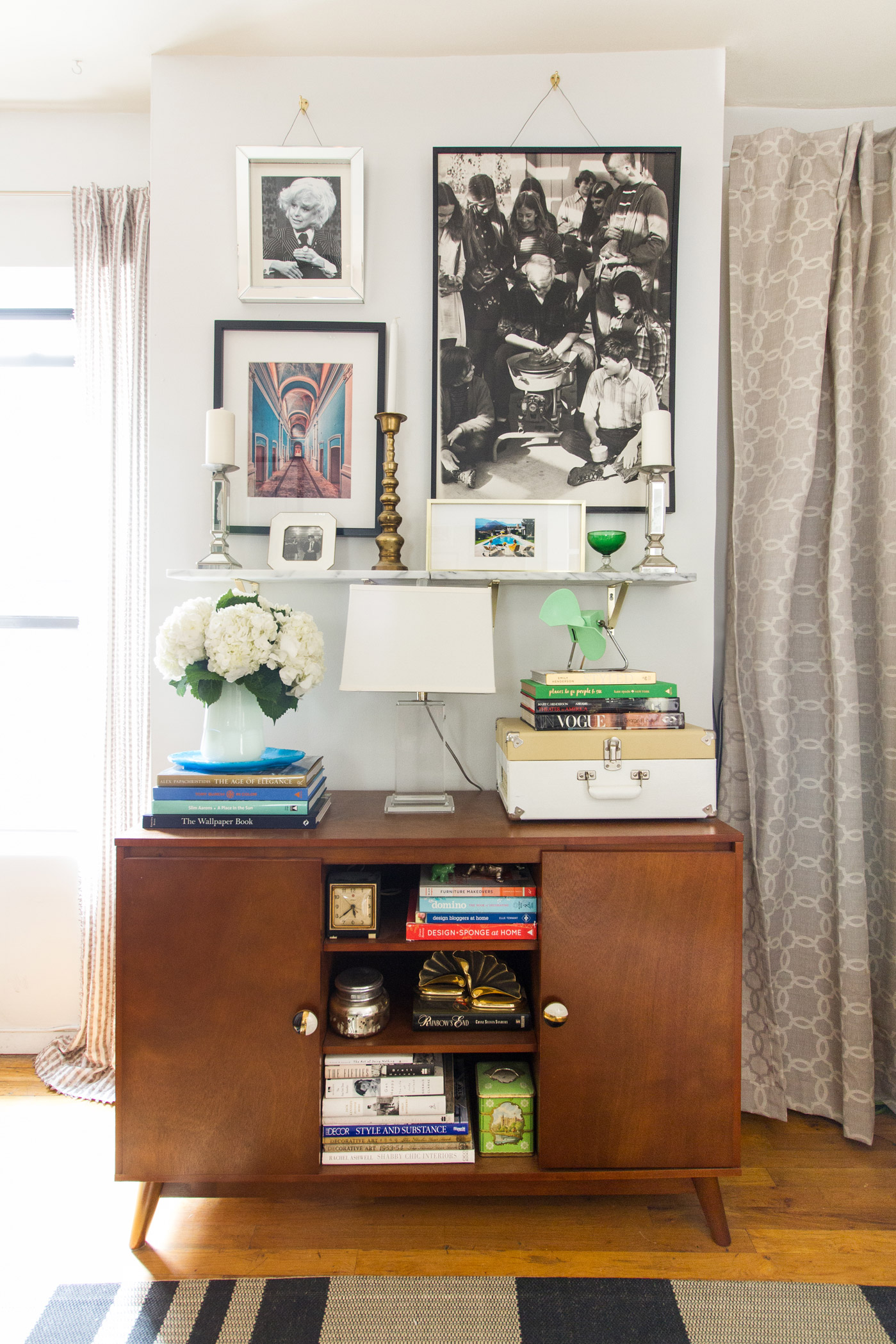
CLOSETS ARE EVERYWHERE (EVEN IF THEY’RE NOWHERE):
Like most New Yorkers making the most of tight spaces, Megan’s apartment lacked adequate storage space. “I hated the idea of shoving cleaning supplies behind my clothes in my bedroom closet, but could never allow a broom to live in plain sight in my living room.” So, she got inventive. Taking advantage of an awkwardly placed alcove wall that had once been a window, Megan hung curtains above the space as well as an actual window, providing the perfect cover for cleaning supplies and other items meant for storage. “People are constantly asking why I don’t open the window!” she said.

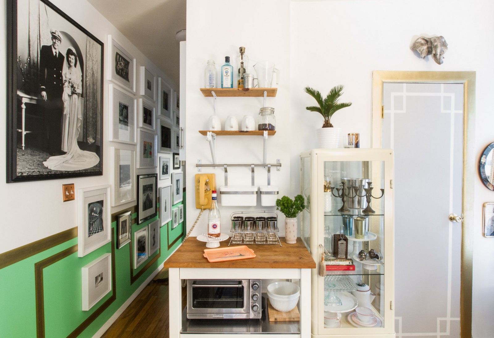
NO STORAGE? NO PROBLEM!
Despite not being a regular cook, Megan’s kitchen had only two kitchen cabinets. For a girl who likes to “host, bake, and set a table properly” with an assortment of cake plates, enamel cookware, serveware and an “extensive” milk glass collection, the space left a lot to be desired. After finding a display case from IKEA, Megan set up the pieces like a museum display. An added bonus? “It’s surprisingly fun to pull a cup or vase off a perfectly curated shelf to use, it feels like you’re getting away with something — even in your own home!”
Visit Homepolish to view more photos of Megan’s amazing apartment.
Photos by Kelsey Ann Rose for Homepolish
Design by Megan Hopp
Like This? See More Before & Afters:


