This past November, we highlighted a lot of design updates for our Android platform. Today, we are announcing some additional design changes for iOS as well as a couple of new features for Android.
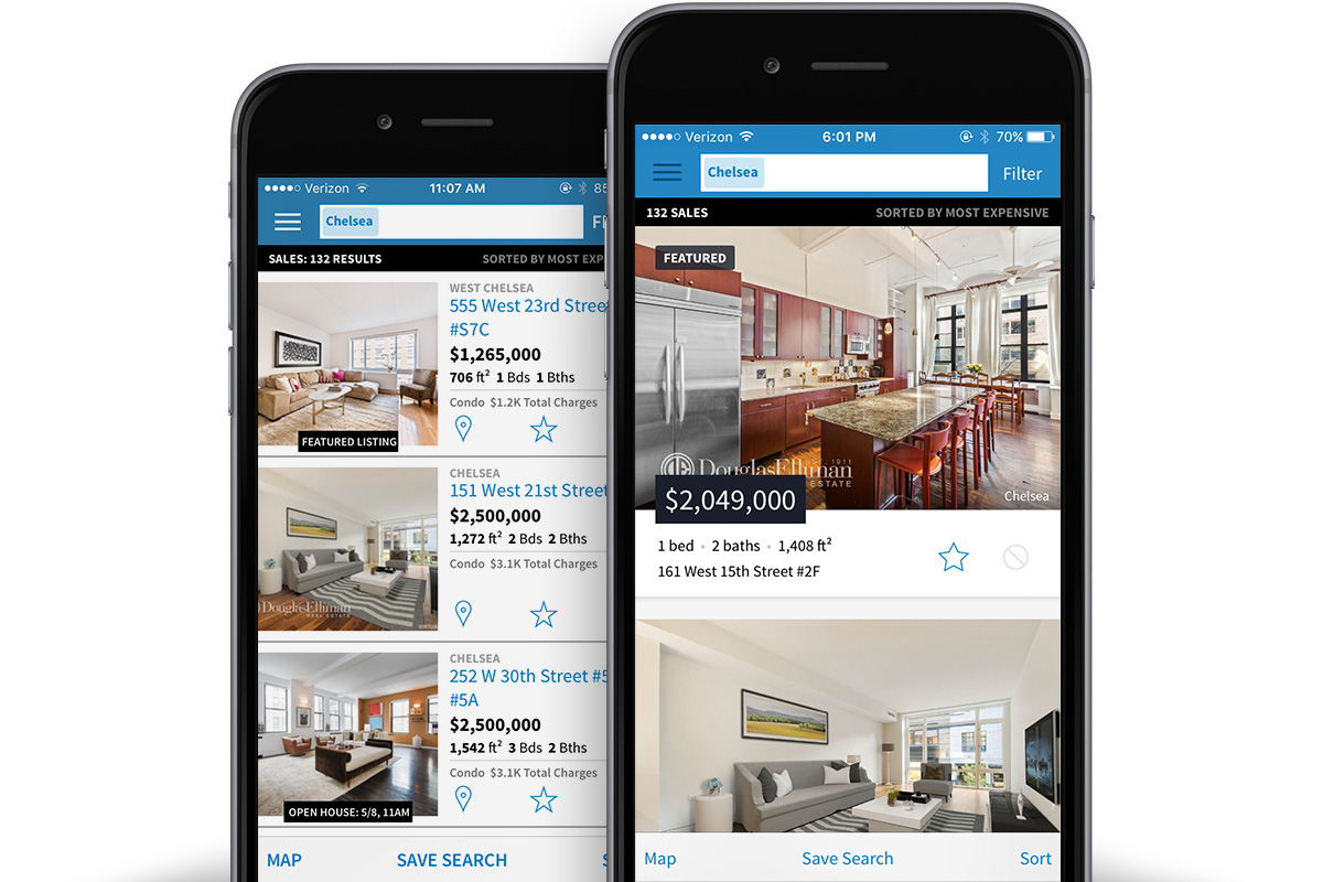 Images Larger in Search Results
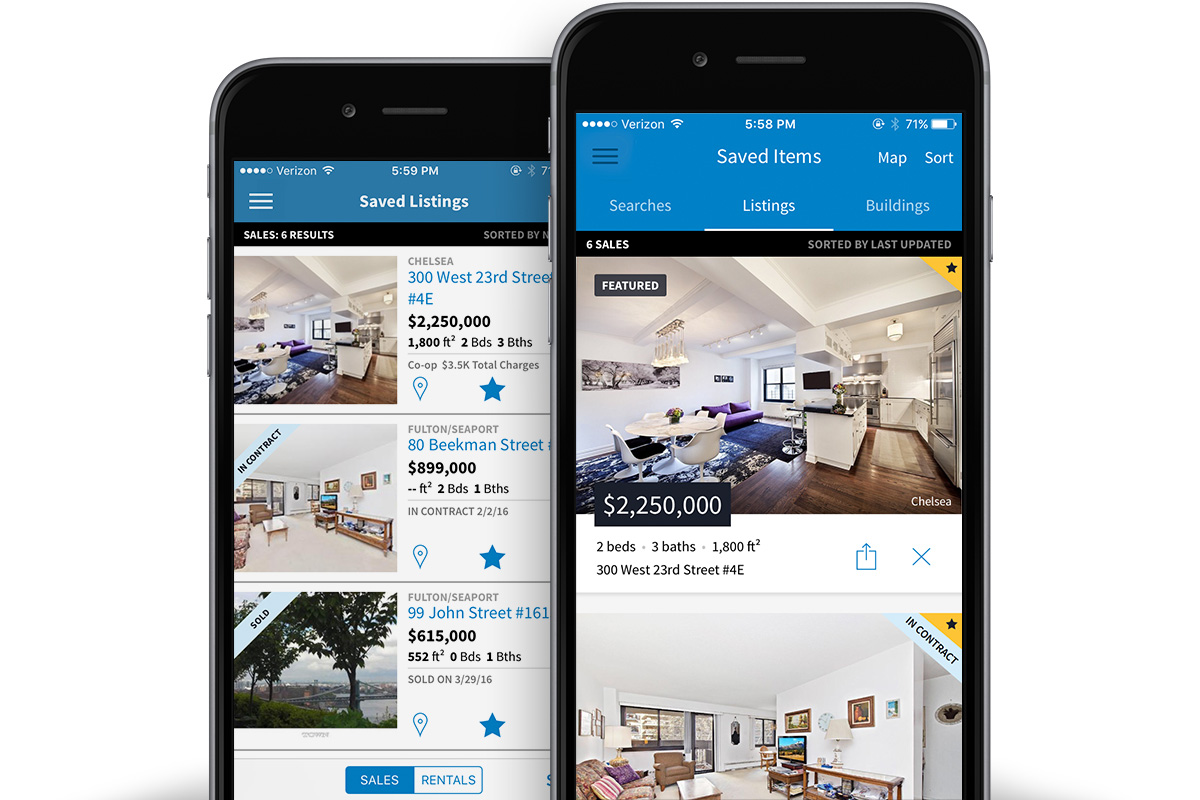
Over the past couple of releases, we’ve incrementally rolled out design changes to the StreetEasy iOS App. Above you’ll see our old mobile search results (left) and on the right, you’ll see our updated Search Results design. Since everyone is immediately drawn to images, we just made them bigger and better to look at. We’ve also reduced the volume of data presented in Search Results. Everything is still visible on the Details page when you click through, but this should allow everyone to digest the information quicker and click through to listings that are the most interesting.
Saved Items Have Been Streamlined
In addition to changing how the Search Results look, the format for our Saved Items has been cleaned up (Photo below: old design on right and new design is on the left). There is now a single Saved Items option in our main navigation menu, which will present the combined Saved Items view that you see below. The tabbed navigation allows for easier toggling between Saved Search, Saved Listings and Saved Buildings, rather than going back to the main navigation every time.
 Map View Shows More Information
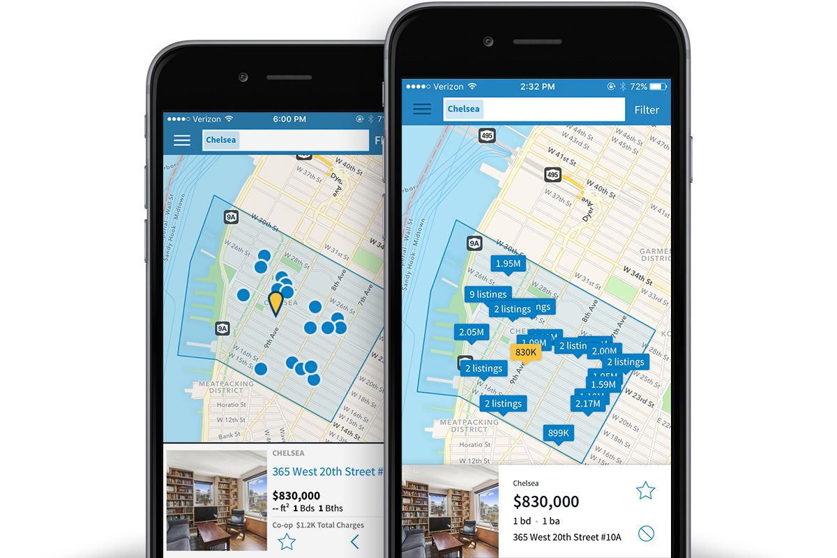
If you prefer to browse listings in Map View, you might have noticed that we rolled out a cleaner and easier-to-navigate Map View as well (Photo below: Old design on left and new design on right). The prices of listings are visible directly on the map, and listings in the same building are consolidated into a single map marker. When you click on a listing in Map View, you’ll also notice that we’ve streamlined information in the little pop-up that shows some of the additional details that you would see in Search Results. This allows you to see more of the map rather than a lot of wasted screen space.
 Cleaner Details Page
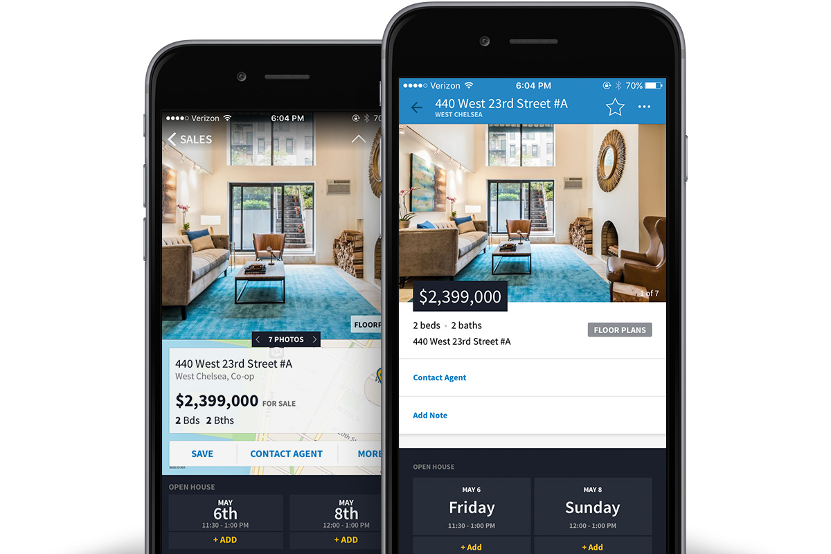
The very last design refresh that we rolled out is a cleaner Details Page. We completely redid this page from scratch to allow for a more unified look and feel between Search Results and the Details Page. Additionally, instead of a very (very) long scrolling view, you can choose to look at the details that interest you most (all the details are collapsed by default). The map at the bottom of the page is easier to see at a glance and you can still click through to view in full-screen mode.
 Android Gets Buildings in its App
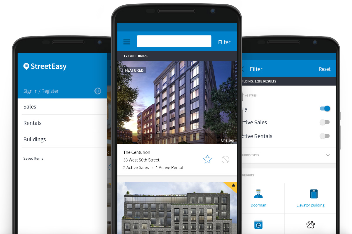
We also rolled out a new feature on Android. You’ll find a new Buildings option listed immediately below Sales and Rentals in the main navigation menu, which allows you to search for specific buildings, which is similar to functionality on our website.
 As always, we love the feedback you’ve been providing us. We have now won a Webby for our app two years in a row and we’d love your help in getting us a three-peat next year!
Continue to send your suggestions to support@streeteasy.com. Tell us about improvements you’d like to see and why you like or dislike the app. We want to make StreetEasy your go-to and the best place to apartment-hunt in NYC.
> Download the StreetEasy app in iOS
> Download the StreetEasy app in Android
Happy shopping!
