It has that tiny hole for a reason.
Look in the wallet of any New Yorker and you are bound to find as single object — the MetroCard. It’s every New Yorker’s ticket to fast, affordable and (relatively) reliable transit around the city. Despite its ubiquity, it rarely garners much attention — except, of course, when it suddenly bears the profile of an iconic rock star. But anyone who looks closely might wonder about the MetroCard’s design: Why does it have that little hole? Why is that one edge beveled? There’s a reason, but to explain it, we first have to understand the card’s history.
The History of the MetroCard
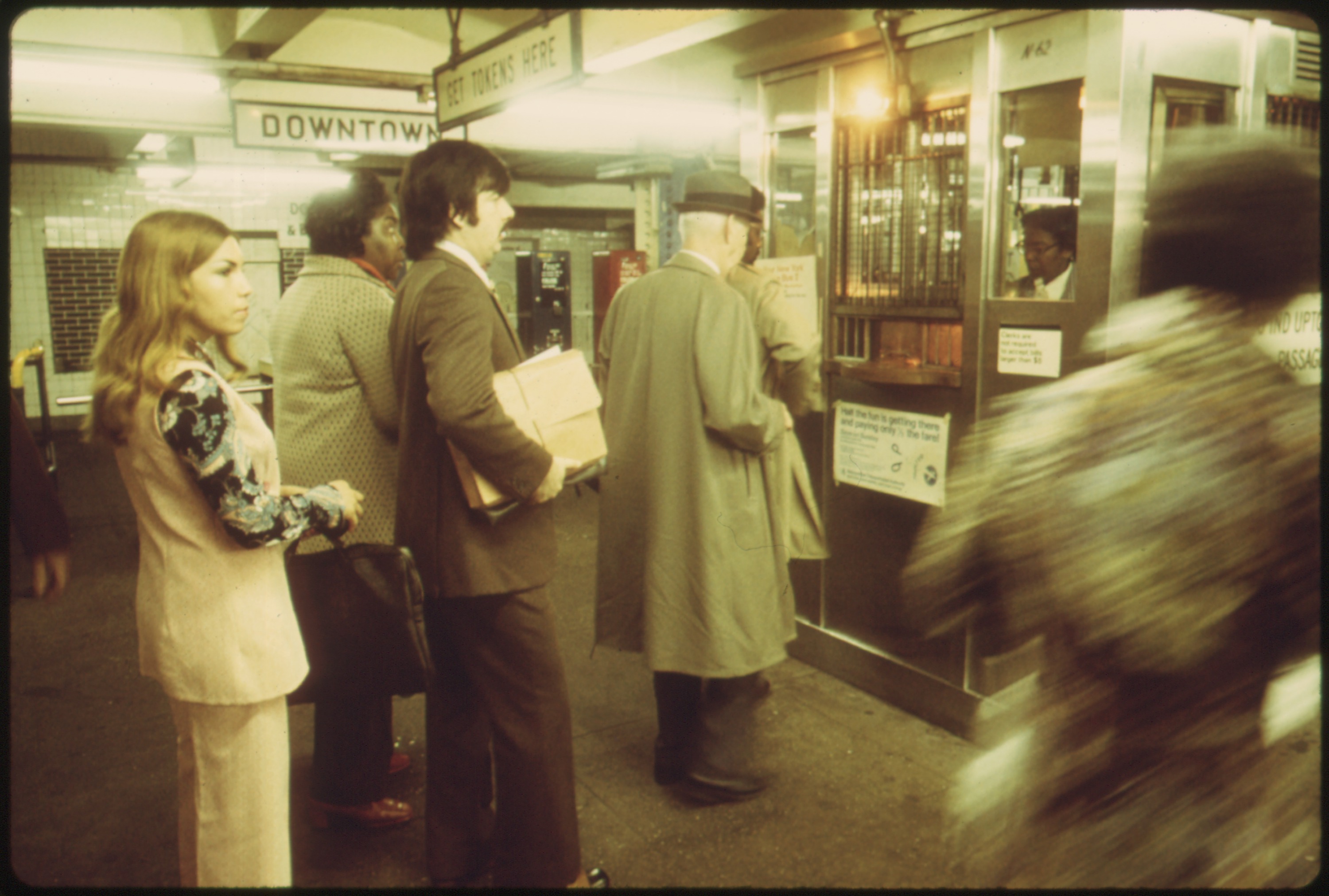
Subway riders waiting to purchase tokens in the 1970s. Source: Wikimedia Commons.
For decades, the NYC subway system relied on metal tokens that riders purchased and deposited in turnstiles. In the 1990s, plastic fare cards were catching on in other major cities as a faster and cheaper alternative to tokens. The MTA board voted to roll out a new fare card by 1991, and in 1992, the new system was given the name “MetroCard.”
The rollout of the MetroCard was slow at first, with only 3,000 released in the first test of the new technology in 1993. Later that year, the first MetroCard turnstiles were unveiled at Wall Street and Whitehall-South Ferry Street Stations. It took another four years for MetroCard turnstiles to be deployed across the entire MTA system. When the first MetroCards were released back in the mid-’90s, they featured a blue background with yellow block lettering, a design that longtime New Yorkers may remember with a twinge of nostalgia. But even then, the transition wasn’t complete: tokens continued to be sold and used as an alternative to the MetroCard until 2003.
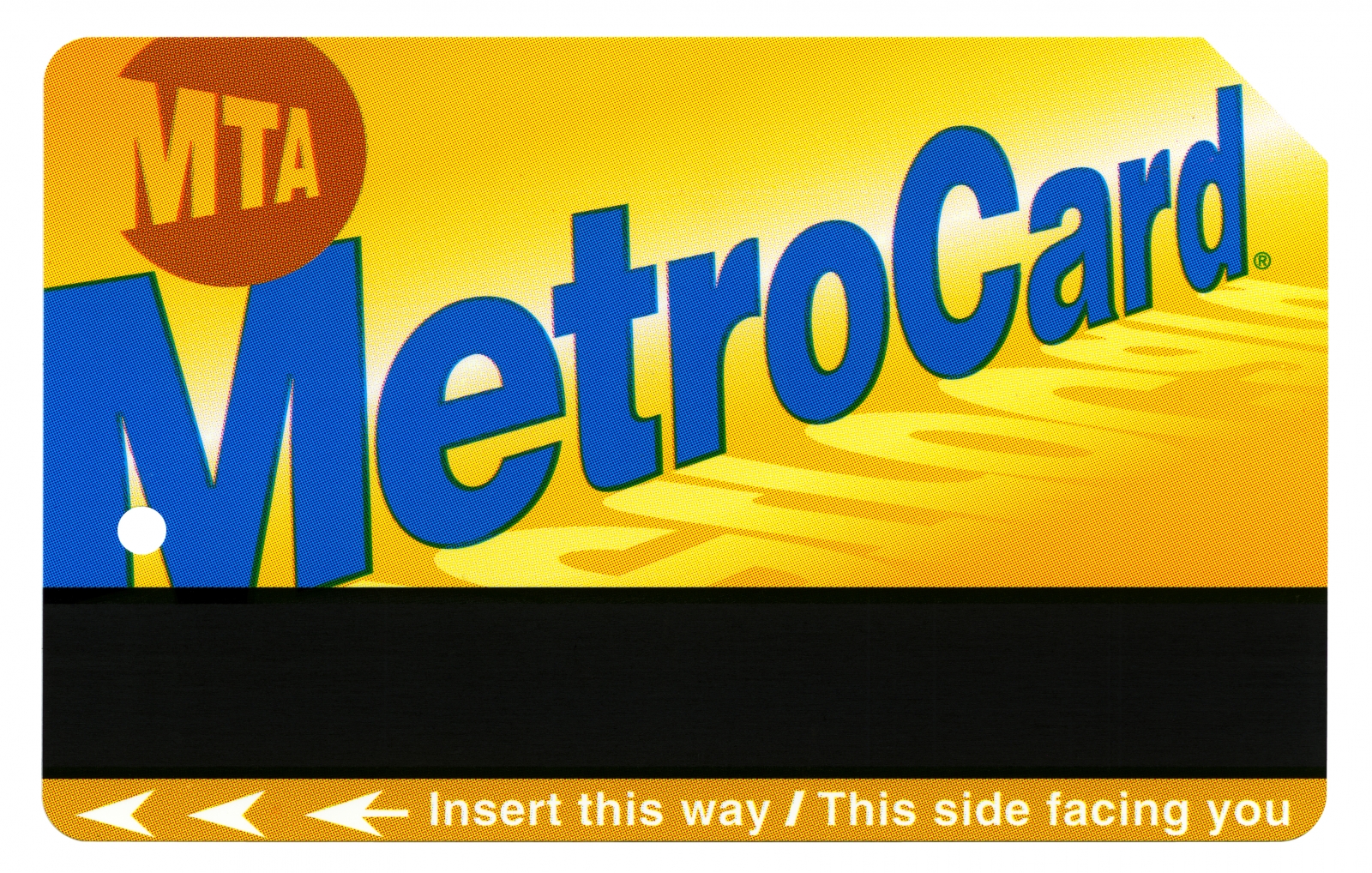
The Current Design of the MetroCard
Over the years, the base cost of a MetroCard has changed substantially, rising to the current $2.75 from the original $1.50. Its overall design, however, has remained consistent. Although the blue backdrop and yellow lettering of the original design was swapped out for the current gold background and blue lettering, the overall size, shape and feel remain the same.
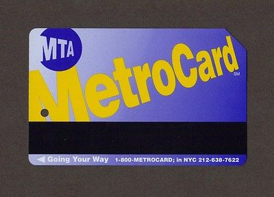
Remember this guy?! (Source: Ebay)
That’s because the design has important features. The slanted rear edge and tiny hole help ensure the efficiency and ease of swiping on buses. They help align the card as riders insert it into fare boxes. Once dropped into the slot, the card enters a mechanism that holds it in place with a rubber grip and pin, ensuring the magnetic strip on the card is facing the right way.
The slanted edge also helps visually impaired riders make sure they’re swiping the card in the right direction.
While the MetroCard’s basic design has not changed, a few limited-edition MetroCards have hit the streets with unique graphics. Here are our top five picks for the most memorable MetroCard designs of the past 20 years.
Source: Instagram/@erinessex
Manhattan Listings Under $2,500 Article continues below


Top Five Recent Limited-Edition MetroCards
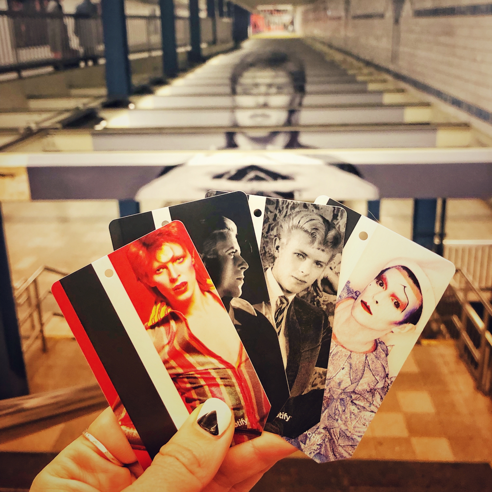
- David Bowie MetroCards — This April, the MTA printed 250,000 David Bowie-branded MetroCards, which were sold at the Broadway-Lafayette and Bleecker Street stations in SoHo. The station itself also received a Bowie rebrand, which was an instant hit on social media. The cards were produced in partnership with Spotify, and feature five images from the “David Bowie Is” exhibit, currently on view at the Brooklyn Museum.
- Barbara Kruger MetroCards — In October 2017, 50,000 MetroCards stamped with the bold questions of artist Barbara Kruger were distributed at four stations across the city. The cards echoed questions that Kruger had posed in various artworks over the years, with queries like, “Who is healed? Who is housed? Who is silent? Who speaks?” The limited edition release was in conjunction with a series of site-specific pieces installed across the city for the Performa Biennial, which took place that November.
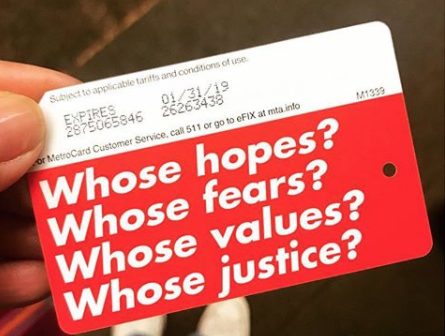
There were only 50,000 of these limited edition Barbara Kruger MetroCards, but they were hard to miss. Source: Cruzcontrol via Instagram.
- Supreme MetroCards — In February 2017, the MTA released Supreme-branded cards in partnership with the trendy streetwear label. Cards were sold at local Supreme stores as well as at Broadway-Lafayette, Queens Plaza, Marcy Avenue, Atlantic Avenue, Prince Street, Spring Street, Union Square, and the 125th Street 2 and 3 train station. The release caused long lines and a lot of excitement among skateboarders.
- Second Avenue Subway MetroCards — To celebrate the long-awaited opening of the Second Avenue subway, the MTA released commemorative cards. The design featured letters spelling out “The Second Avenue Subway” in colorful Helvetica font. On the back, the card read “This is the new MTA.” Suffice it to say, straphangers were more excited about the new subway line than the new MetroCards.
- Brooklyn Nets MetroCards — In 2014, the Nets promoted the start of their second season as Brooklyn’s hometown basketball team with a limited series of branded MetroCards. With the Nets’ stadium (Barclays Center) directly above one of the largest transportation hubs in the city, the franchise and the MTA have always had a close relationship. One MTA spokesperson said the card was a nod to that connection, and a way of encouraging Nets fans to take public transportation to the games.
The Future of MetroCard Design
Despite its design and functionality, the MetroCard is ripe for an update. In October 2017, the MTA announced that it will modernize its payment system by allowing riders to wave their smartphones or credit cards in front of a scanner, instead of swiping. By the end of 2018, there will be 500 electronic readers across the subway stations. The new design strategy takes a cue from the London Underground, which installed similar technology. The MTA estimates that electronic readers will reach all stations and buses by 2020. Thankfully, for all you loyal MetroCard swipers out there, the glorious golden cards will be usable until 2023.
—
Hey, why not like StreetEasy on Facebook and follow @streeteasy on Instagram?