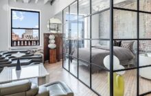
Soothing Paint Colors/Low VOC Paints

Started by lobster
about 16 years ago
Posts: 1147
Member since: May 2009
Discussion about

1. For bedroom walls, any opinions on which color(s) are the most soothing? It doesn't have to be a neutral color, just something restful to the eye. I actually like blues and greens, but have found it difficult to find a quiet shade in these colors. 2. Are there any negatives (besides cost) to low VOC paints? Has anyone who suffers from seasonal allergies/dry eyes used low VOC paints and found that it made a difference to them? Btw, I found this interesting book published by Rizzoli entitled "The Way We Live in the City" which has great photos of city apartments from around the world. Thanks in advance for all responses and opinions.


two beautiful restful greens: Benjamin Moore HC114 is a cozy mid-khaki green, looks really nice in incandescent light.
Silver Sage 506 1B is pale and calm.
A wonderful taupe that almost reads as white in sunshine:
I adore the color of Pratt & Lambert "Pebble" but P&L paint is not as nice as Benjamin Moore.
Farrow and Ball - Green Ground, Pavilion Blue
For a calm feel, pick a paler, greyer blue or green. Something that look right in a square inch may be too intense on 4 walls.
As for allergies, low VOC paints have nothing to do with them (think acute vs.chronic problem.) Low VOC paint are better for the environment, and less toxic as they are applied, but once the paint is dry, it won't matter.
On the other hand, the finish matters. You will get cleaner air with a matt finish than with a gloss.
My foyer is painted Restoration Hardware Silver Sage. I love the color, which alternates between green, blue, and gray depending on the light, and will miss it when we move. (It won't work in the new place for various reasons.) In a friend's house, I came across another restful green I loved -- Peaceful Jade 1494 by Benjamin Moore.
For pre-war apartments, I like Restoration Hardware shades because you can never go wrong. Our current apartment is entirely RH colors. (In addition to Silver Sage, we used Butter Cream, Latte, and Atmosphere Blue.) Their stores usually have entire walls painted in their colors, so you can get a really good idea what the end product is going to look like and won't be deceived by a paint chip. I found the paint difficult to work with, though -- too thick and dried too fast. So, instead, I'd take the chip to Benjamin Moore or Home Depot and get it color-matched.
I tried Restoration Hardware Silver Sage. Found it too dark (in a bright room).
lad, the color in the store is kind of meaningless. it depends on light and intensity, so your direction and elevation really matter.
what works better, i've found, is paint samples. try them out before you commit to a wall, room or (in the extreme) an apartment.
I once had an architect tell me that color theory is that response to colors changes over time, so cold colors like blues are initially restful but then excite over time, and warm colors like reds are initially exciting but then restful over time. I don't know if that theory is hogwash or not, but by its lights you should have a red bedroom.
Try playing with the personal color viewer at Benjamin Moore.com, though be aware that it doesn't perfectly match the colors. You might like 486, which is a gray green with a lot less blue in it than Resto's Silver Sage, or Sanctuary, which is a very icy gray lavender -- sort of a John Saladino color. I've used them both in sleeping areas and liked the results.
Our bedroom now is currently Interlude, but be aware that it reads a lot less taupe than on the PCV. In southern light it's more like a tan. Also we had an eggplant bedroom once, very dark, and that worked well too.
ali r.
Blues and greens are indeed most "restful" for bedrooms.
For greens, stick with the more "earthy" shades (tending towards yellow; sages, olives, etc.) rather than the "minty" shades (tending towards blue; seafoam, kelly, etc.). The minty greens tend to be more "bright" and "alive", while the earthy shades tend to be more "at rest" and "grounded".
For blues, I'd stick with the grayish blues, rather than the greenish blues; slate blue, in particular.
And as far as the assertion about your response to color changing over time -- yes, that's hogwash. However, it is true that different people feel more comfortable around certain families of colors than others. For instance, many of the ultra-modern apartment interiors in NYC sport "cool" colors throughout; stark whites, sky blues, violets, grays, etc. While I can appreciate their beauty, I know I myself could never feel "at home" around such colors. My entire apartment is painted in the classic 1970s "warm" color palette (also known as "fall" colors): Orange kitchen (with white cabinets), Bryant Gold living and dining room (with orange and red circular geometric rug in the living area, solid textured olive green rug in the dining area) with dark oak furniture, "split pea" green bedroom with white rug. Rich brown in the entry foyer and back hallway. Perhaps it's my personality, or perhaps it's what I grew up with (and therefore have happy childhood memory associations), but my circa-1970s color scheme makes me feel calm, at peace, and at *home*.
And as far as low-VOC paints -- give me a break. Unless you're living the purest of lives like a monk in Tibet, eating absolutely NO chemicals (high fructose corn syrup, hydrogenated oils, artificial colors, flavors, sweeteners, totally hormone- and antibiotic-free meat and dairy) and you walk the streets of NYC with a gas mask, whatever fumes given off by regular "toxic" paint (which are nearly 100% dissipated within a week anyway) would make absolutely NO health difference whatsoever.
benjamin moore aura affinity fandeck
if we weren't in a rental i might have gone with farrow and ball. the colors are gorgeous.
Lobster: you would love Tunsgate Green, Green Ground, Pavilion Blue and Pavilion Grey.
I also like Summer Blue (by Benjamin Moore) and Creme Fraiche.
benjamin moore "restful moments" ( ithink) . It's a blue that tends towards grey and changes nicely with the light. I have it in my bedroom.
Actually-i think the correct name was "quiet moments". Not sure of the number
Silvery blue is also a very restful blue by BM.
Wow! So much great, wonderful information.
I went to the bookstore this afternoon and bought this book, "House Beautiful: Colors For Your Home, 300 Designer Favorites". The book contains a color index with many of the BM, Farrow & Ball, Donald Kaufman and other companies paint offerings. I will look up all of your suggestions with the samples in the book and then proceed to the stores for a better look.
I wasn't certain if blue or green or blue/green or a similar variation would be right for a bedroom. I tend to gravitate towards the blue/grey shades, but question if that might be too "cold".
Much much thanks to everyone.
I would so totally stick with the electro-pastels. They're more fabulous over-all.
And don't worry about VOCs ... they're your most bestest friends in the whole wide world. Don't be tricked by the health-food industrial complex (they're Communiss).
coming up next, AH presents a new line of paint colors including "Sidecar Mist" :>
Flat off-whites (but ONLY flats) work extremely well.
And if you try different off-white on the 2 connecting walls, it'll give you a warm but very elegant feel. I assume your ceiling is white, so 2 shades off in different off-white flats.
Benjamin Moore - Nantucket Fog AC-22 or James River Gray AC-23. Have received many compliments
I will swear by BM Hawthorne Yellow. Extremely calming. In the historical collection. Have it in my living room. Also, I painted my entire apartment with natura brand (no/low VOC) and that few extra dollars a can was some of the best money I ever spent in my life. You will thank yourself over and over when painting. Also, when you purchase this type of paint, you are making a statement as a consumer about the harmfulness of chemicals. A pretty important statement in this day and age.
I used Home Depot's Freshaire Choice paint in Organic Garden, which is a soft grey-green color, no VOCs. Works well in any room and provides a nice contrast to white/silver accents. http://freshairechoice.com/Product.html#/Product_Colors/
BTW, most mom-and-pop HW stores or local chains will give you a discount if you ask.
"I will swear by BM Hawthorne Yellow. Extremely calming."
Do NOT paint a bedroom yellow. Yellow has been proven to cause sleeping problems in adults, and colic in babies.
Keep the yellow in the living areas.
whoops.. i missed the first three lines of the post : )
BM china white is nice too.. very boney/creamy.
Go to "colorful" open houses. Check out apartments with rooms with similar light yours is getting.
Once you have an idea of what colrs make you feel comfortable in the room, than you can go on to strength of shade or tint.
You'd be surprised what actually standing in a room can do for your decision, vs looking at endless swatches.